

Tailwind에서 재사용 가능한 컴포넌트로
지금까지 아토믹 디자인을 적용해 UI의 시각적인 요소들을 토큰이라는 계층으로 분류하고,
이 토큰들을 Tailwind에서 사용할 수 있도록 class로 옮겼다.
드디어 Tailwind를 통해서 컴포넌트를 만들 수 있는 준비가 끝난 것이다.
그렇다면 Tailwind를 사용해서 무작정 컴포넌트를 만들기만 하면 되는걸까?
아토믹 디자인에서부터 느꼈겠지만, 치스톡 프로젝트는 하나의 컴포넌트 디자인 시스템을 기반으로 구성되어있다.
이런 디자인 시스템의 컴포넌트의 핵심은 "디자인 선택지를 받아서 정해진 디자인을 출력"한다는 것이다.
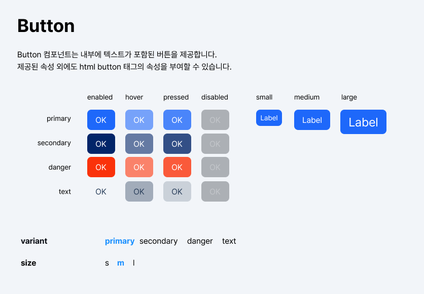
예를 들어, 버튼 컴포넌트의 요구사항이 위와 같다고 하자.
css-in-js를 사용하면 가장 좋겠지만, 우리는 Next 13에 Tailwind를 환경이므로 className 기반으로 동작하도록 만들어야한다.
이에 당장 떠오르는 방법은 삼항 연산자를 통해서 각 props별로 className을 지정하는 방법일 것이다.
그리고 실제로 삼항 연산자를 통해 개발을 해보면 이를 깔끔하게 개발하기가 쉽지 않다는 것 역시 깨닫게 될 것이다.
const Button = (
  { children, variant, size, ...props }: ButtonProps,
  ref: React.LegacyRef<HTMLButtonElement> | undefined
) => {
  return (
    <button
      ref={ref}
      className={`flex justify-center items-center gap-s w-auto h-auto overflow-hidden rounded-m ${
        variant === "primary"
          ? "bg-primary text-primary-on"
          : variant === "secondary"
          ? "bg-secondary text-secondary-on"
          : variant === "danger"
          ? "bg-red text-red-on"
          : "text-surface-on-variant"
      }`}
      {...props}
    >
      {children}
    </button>
  );
};
당장 하나의 속성만 처리해도 이런데 요구사항이 늘어나면 어떻게 될까?
유지보수도 어려울 뿐더러 가독성도 심하게 떨어질 것이다.
이를 해결하기 위해 객체 형태로 분리해두고 key - value 가져오는 방법도 물론 있겠지만,
이를 쉽게 구성할 수 있게해주는 도구가 있다면 더 편리하지 않을까?
바로 이 도구로, cva를 소개한다.

Class Variance Authority, 줄여서 cva는 전통적인 CSS 접근법으로
컴포넌트에 다양한 스타일을 맵핑할 수 있도록 도와주는 라이브러리다.
여기에 추가적으로, Tailwind class 병합 시 충돌을 막아주는 tailwind-merge를 같이 사용한다면
Tailwind를 사용한 컴포넌트 개발 환경을 구성할 수 있다.
yarn add class-variance-authority tailwind-merge
이후 VS Code 설정 json 파일에 아래 코드를 붙여 넣어주자.
{
  ...,
  "tailwindCSS.experimental.classRegex": [
    ["cva\\(([^)]*)\\)", "[\"'`]([^\"'`]*).*?[\"'`]"],
    ["cx\\(([^)]*)\\)", "(?:'|\"|`)([^']*)(?:'|\"|`)"]
  ],
}
cva 및 cx 함수 내에서도 tailwindIntellisense를 사용할 수 있게 만들어준다.
기본 템플릿
Tailwind 설정을 커스텀했다면 tailwind-merge 설정하기 게시글을 참고하여
tailwind-merge를 설정해주는 사전 작업이 필요하다.
컴포넌트를 만들기 위한 기본 템플릿은 아래와 같다.
import { forwardRef } from "react";

import { VariantProps, cva, cx } from "class-variance-authority";
import { twMerge } from "tailwind-merge";

const componentVariants = cva(
  "class list", //common class list
  {
    variants: {
      option1: { themeName: "class list", otherThemeName: "class list" },
      option2: { themeName: "class list", otherThemeName: "class list" },
    },
    defaultVariants: {
      option1: "themeName",
      option2: "themeName",
    },
  }
);

type ComponentPropType = VariantProps<typeof componentVariants> &
  Omit<React.ComponentProps<HTMLComponentElement>, keyof VariantProps<typeof componentVariants>>;

function Conponent(
  { children, className, option1, option2, ...props }: ComponentProps,
  ref: React.ComponentPropsWithRef<HTMLComponentElement>["ref"]
) {
  return (
    <div ref={ref}
      className={twMerge(cx([className, componentVariants({ option1, option2 })]))}
      {...props}
    >
      {children}
    </div>
  );
}

export default forwardRef<HTMLComponentElement, ComponentProps>(Conponent);
복잡해보이겠지만 실제로 알아야할 부분은 많지 않다. 하나씩 분석해보자.
cva 함수 만들기
cva 함수는 설정을 입력하면, 선택지를 받아서 하나의 class string을 return해주는 함수를 만들어준다.
const componentVariants = cva(
  "class list", //common class list
  {             //style list object
    variants: {
      option1: { themeName: "class list", otherThemeName: "class list" },
      option2: { themeName: "class list", otherThemeName: "class list" },
    },
    defaultVariants: {
      option1: "themeName",
      option2: "themeName",
    },
  }
);
cva 함수를 사용할 때 2가지 인자가 들어가는데,
하나는 모든 스타일에 공통적으로 들어갈 스타일(common class list)이고,
다른 하나는 스타일 옵션들을 정의하는 객체(style list object)이다.
variants 속성은 선택지 옵션 종류별로 스타일 이름(themeName)과 스타일이 선택되었을 때 반영될 class list를 작성한다.
class list는 하나의 string이어도 되고, class들을 나열한 string 배열이어도 된다.
defaultVariants에는 각 스타일 옵션의 선택지 중 아무 것도 선택하지 않았을 때 출력할 기본 스타일 옵션을 정의해준다.
실제로 위 요구사항을 구현해보면 아래와 같다.
const buttonVariants = cva("relative flex justify-center items-center overflow-hidden rounded-m p-xs", {
  variants: {
    variant: {
      primary: "bg-primary text-primary-on",
      secondary: "bg-secondary text-secondary-on",
      danger: "bg-red text-red-on",
      text: "text-surface-on-variant",
    },
    size: {
      s: "text-s",
      m: "text-m",
      l: "text-xl",
    },
  },
  defaultVariants: {
    variant: "primary",
    size: "m",
  },
});
이를 해석해보면 buttonVariants는 variant와 size를 입력받아서 class string을 return하는 함수이다.
모든 스타일에는 공통적으로 relative ~~ 가 들어가고,
variant와 size를 선택함에 따라 추가적으로 class string이 들어간다.
아무것도 선택하지 않았을 경우에는 variant에는 primary가 size에는 m이 기본적으로 선택된다.
// variant="primary" size="m"
"relative flex justify-center items-center overflow-hidden rounded-m p-xs bg-primary text-primary-on text-m"
cva 함수 사용하기
function Conponent(
  { children, className, option1, option2, ...props }: ComponentProps,
  ref: React.LegacyRef<HTMLComponentElement> | undefined
) {
  return (
    <div
      ref={ref}
      className={twMerge(cx([className, componentVariants({ option1, option2 })]))}
      {...props}
    >
      {children}
    </div>
  );
}
cva 함수를 사용하려면 className에 이를 설정해주면 된다.
컴포넌트에서 props로 우리가 설정했던 스타일 옵션들을 받아와서 componentVariants 함수 매개변수에 객체의 형태로 전달한다.
twMerge(cx([componentVariants({ option1, option2 }), className]))
componentVariants는 객체 형태로 옵션을 받아서
그에 해당하는 스타일 class들을 묶어 하나의 class string으로 리턴한다.
cx는 cva에서 제공하는 class를 병합해주는 기능의 함수로,
정확하게 말하면 clsx라는 별도의 라이브러리를 cva에 cx라는 이름으로 포함시켜 놓은 것이다.
여기서는 cva 함수에서 설정된 class 외에 다른 className들을 병합해주기 위해 사용했다.
그 다음, tailwind-merge를 통하여 tailwind class의 충돌을 해결해준다.
Tailwind CSS의 기본 테마가 아닌 커스텀 설정을 사용한 경우 tailwind-merge에 추가적인 설정이 필요함에 유의하자.
이 과정을 거치면 최종적으로 우리가 설정했던 옵션들을 가진 하나의 class string이 만들어진다.
이렇게 만들어진 class string을 className에 넣어주어 사용하면 된다.
만약 tailwind-merge나 cx 함수가 필요하지 않은 경우 생략할 수 있다.
중요한 것은 cva 함수를 className에 넣어주는 것이다.
위 요구사항의 버튼 컴포넌트를 이를 통해 구현하면 아래와 같이 작성할 수 있다.
const Button = (
  { children, className, variant, size, ...props }: ButtonPropsType,
  ref: React.ComponentPropsWithRef<"button">["ref"]
) => {
  return (
    <button ref={ref}
      className={twMerge(cx([buttonVariants({ variant, size }), className]))}
      {...props}
    >
      {children}
    </button>
  );
};
className을 cva 함수 앞에 넣어주느냐, 뒤에 넣어주느냐에 따라서 적용 우선 순위가 달라짐에 유의하자.
PropsType 설정해주기
import { VariantProps } from "class-variance-authority";

type ComponentPropType = VariantProps<typeof componentVariants>
TypeScript에서 Props들을 받아오려면 타입 설정이 필요하다.
cva는 이를 위해 VariantProps를 제공한다.
컴포넌트의 PropsType 설정 시 위와 같은 형태로 정의할 수 있다.
이를 실제 Button에 사용해보면 아래와 같다.
export type ButtonPropsType = ComponentPropsWithoutRef<"button"> &
  VariantProps<typeof buttonVariants>;
VariantProps에 buttonVariants의 type을 넣어 ButtonPropsType을 선언해주었다.
(ComponentPropsWithoutRef는 button 태그의 PropsType을 가져오는 부분이다.)
완성된 Button 컴포넌트
import { VariantProps, cva, cx } from "class-variance-authority";
import { ComponentPropsWithoutRef } from "react";
import twMerge from "@utils/customTwMerge";

export type ButtonPropsType = VariantProps<typeof buttonVariants> &
  ComponentPropsWithoutRef<"button">;

const buttonVariants = cva("relative flex justify-center items-center overflow-hidden rounded-m p-xs", {
  variants: {
    variant: {
      primary: "bg-primary text-primary-on",
      secondary: "bg-secondary text-secondary-on",
      danger: "bg-red text-red-on",
      text: "text-surface-on-variant",
    },
    size: {
      s: "text-s",
      m: "text-m",
      l: "text-xl",
    },
  },
  defaultVariants: {
    variant: "primary",
    size: "m",
  },
});

const Button = (
  { children, className, variant, size, ...props }: ButtonPropsType,
  ref: React.ComponentPropsWithRef<"button">["ref"]
) => {
  return (
    <button ref={ref}
      className={twMerge(cx([buttonVariants({ variant, size }), className]))}
      {...props}
    >
      {children}
    </button>
  );
};

export default Button;
위 과정을 통해 간단하게 Button 컴포넌트를 만들어 볼 수 있었다.
이 Button 컴포넌트는 아래처럼 작성해 사용하면 된다.
<Button variant={"secondary"} size={"s"}>Button</Button>
props를 적절히 변경하면 아래처럼 cva 함수에서 설정한 스타일을 쉽고 빠르게 만들어낼 수 있다.
Reference
Youtube / Creating High-Quality React Components: Best Practices for Reusability - Josh tried coding
cva - Class Variance Authority
'Frontend > React' 카테고리의 다른 글
| 태그에 따라 바뀌는 React 컴포넌트 만들기 2 - As 속성 제한하기 (0) | 2023.09.06 |
|---|---|
| Icon 컴포넌트 만들기(with SVGR, 동적 import) (0) | 2023.08.08 |
| 태그에 따라 바뀌는 React 컴포넌트 만들기(with TypeScript) (0) | 2023.08.03 |
| 무한스크롤 컴포넌트 구현하기 -1- (0) | 2023.04.25 |
| 프론트엔드에서의 TDD (0) | 2023.04.08 |